
Every online store wants one thing: more sales!
You can spend all the money in the world on ads, bring in thousands of visitors, and still end up with very few actual buyers. The reason is very simple — your website isn’t doing its job.
People leave because something doesn’t feel right. They hesitate, get confused, or simply don’t enjoy the shopping experience. A good e-commerce website doesn’t just look nice — it guides the user, builds trust, and makes it easy to buy.
As a leading web development company in Dubai, we’ve seen this pattern across many online stores. That’s why, in this blog, What Makes an E-Commerce Website Convert? UI/UX Secrets Revealed, we’re sharing simple (but powerful) UI/UX secrets that can turn casual browsers into loyal customers.
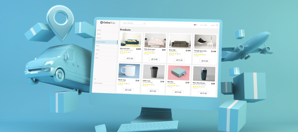
1. Clear and Simple Navigation
When someone visits your site, they should know where to go without thinking too much. If users have to stop and figure out how to find a product, most will just leave.
Good websites use clean menus. The main categories should be visible right at the top. Subcategories should drop down neatly. If someone types in a product name, the right results should show up fast.
Tip: Keep your navigation labels simple. Use words like “Men,” “Women,” “Shoes,” or “Sale.” Avoid fancy names that confuse people.
2. Fast Loading Speed
Slow websites kill sales. People don’t like to wait, especially when they’re shopping. If your website takes longer than three seconds to load, many users will leave before even seeing your homepage.
Speed matters on every page. Homepage, category pages, and product pages. Use optimized images, clean code, and avoid too many pop-ups or scripts that slow things down.
You can test your speed using free tools like Google PageSpeed Insights or GTmetrix. Fixing speed problems may need help from a developer, but it’s worth the effort.
3. Mobile-Friendly Design
If your site looks weird or is hard to use on a mobile screen, you’re missing out on a huge group of customers.
A mobile-friendly site adjusts to fit small screens. The text stays readable, buttons are easy to tap, and the checkout process is smooth. Avoid tiny fonts, messy layouts, and sliders that don’t work on phones.
Tip: Test your website on different phones. Try browsing, adding to cart, and checking out. If anything feels annoying, fix it.
4. Clear Product Pages
A good product page answers every question the customer has. It shows clear photos, gives useful details, and makes buying easy.
Use high-quality images with zoom features. Show the product from different angles. If it’s clothing, include size charts. If it’s electronics, add technical specs.
The price, delivery time, return policy, and reviews should all be right there on the page. People don’t want to go searching for important info.
5. Honest and Helpful Reviews
Most shoppers read reviews before buying. Real reviews build trust. They help people feel safe and confident in their choices.
Encourage your customers to leave reviews after buying. Send a follow-up email asking for feedback. Show both good and bad reviews, Well, no product is perfect, and shoppers know that.
Tip: Don’t fake reviews. People can usually tell. It’s better to have fewer honest reviews than a bunch of suspicious ones.
6. Smooth Checkout Process
Many shoppers leave right at the end. They want to buy, but the checkout is too long, confusing, or asks for too much.
Keep your checkout short and simple. Ask only for the information you need. Offer guest checkout so people don’t have to make an account. Show a progress bar so they know how many steps are left.
Make sure payment options are clear. Support popular methods like credit cards, UPI, PayPal, or net banking. If your audience is in India, for example, COD (cash on delivery) still works well.
7. Consistent Design and Clean Layout
People feel more comfortable on websites that look neat and stay consistent across all pages. If your fonts, colors, or button styles keep changing, it makes the site feel untrustworthy.
Use a color theme that matches your brand. Stick to 1-2 fonts across the site. Keep enough space between things so the page doesn’t feel crowded.
Avoid too many pop-ups. One welcome discount is okay. But don’t bombard users with pop-ups every few seconds.
8. Trust Signals Everywhere
Online shopping means people are trusting you with their money. They need to feel safe.
Signals of Trust are items like secure payment badges, customer feedback, return policies, and contact information. Indicate that your site is secure (use HTTPS), provide a customer support number, and show a physical location of your business.
Include some social proof items. “10,000+ customers served” or “as seen on …” logos are also helpful.
9. Smart Use of CTAs (Call to Action)
CTAs are buttons and links that instruct users to do something, e.g; “Buy Now”, “Add to Cart”, “Subscribe”, etc.
Your CTAs need to pop. Use colors that are appropriate for your site but stand out and grab attention. Use straightforward wording that tell your users exactly what will happen. Use “Continue”, or “Next” instead of “Go!”, etc.
Place your main CTAs above the fold (i.e.; it can’t be missed without scrolling down), and potentially even put them again further down the page if your content or product requires a longer explanation.
10. Keep Testing and Improving
A great site is never really “done.” Customer behavior changes, trends change, and even small tweaks can make a big difference.
Use tools such as Google Analytics or Hotjar to see what people are doing on your site. Are they getting stuck somewhere? Are they abandoning their cart at checkout?
A/B testing is also a great method. For instance, you could test two versions of a product page with different images or CTA buttons. Track the performance, determine which version worked best, and make updates based on findings.
Creating an e-commerce website that converts is not about using buzz words or chasing trends, it is about creating easy, clear, and pleasurable shopping experiences.
Effective UI/UX will help your customer trust your store. It will remove any confusion and make it easy to purchase. If your visitors feel comfortable, they will spend more time, explore more pages, and most importantly, buy.
You don’t need a huge budget to get these right when it comes to your ecommerce website development. Start small. First, with the basics, fix each thing one by one. It might surprise you how small changes can make your site not only look good, but also increase sales.